How Much Renewable Energy Do We Need?
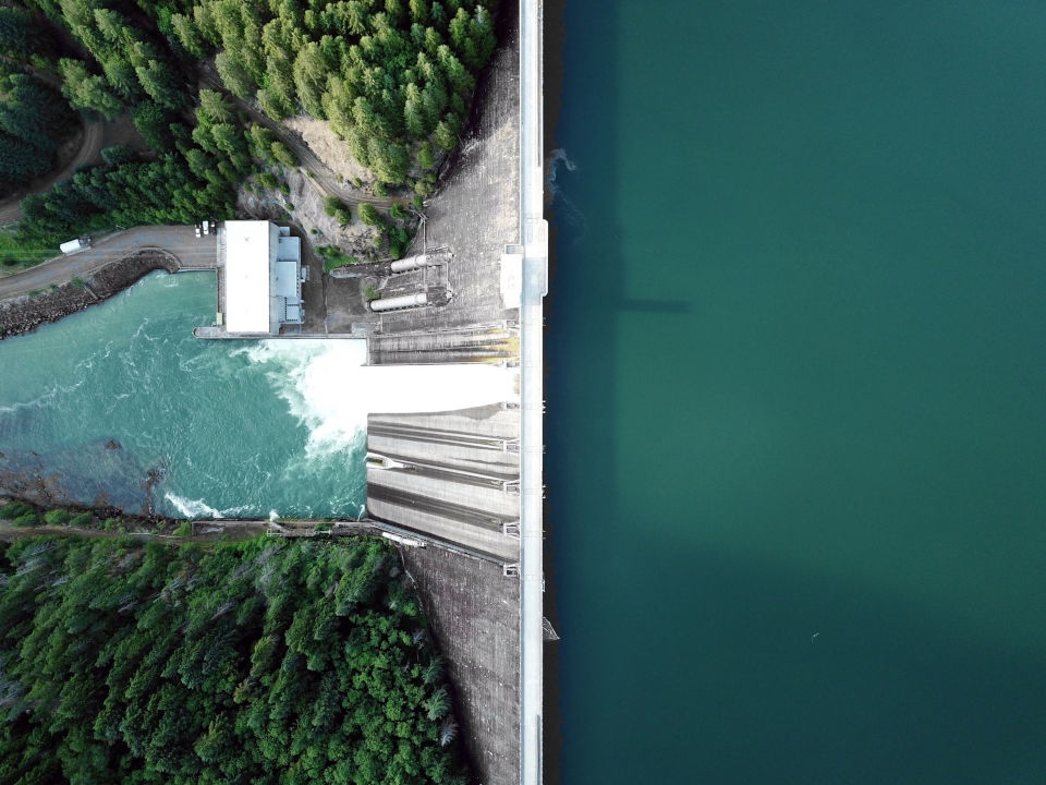 Hydropower. Beautiful.
I recently read Sir David MacKay’s excellent book “Sustainable Energy - without the hot air”. If (like me a few months ago) you haven’t heard of it, do yourself a favor and give it a read - it is available for free and worth every minute of your time. It was published in 2009 but presents concepts that remain highly relevant today. If you don’t have capacity for a whole book, you should invest 20 minutes to watch David’s excellent TED talk. In an era where headlines about climate change are either overly dramatized or grossly trivializing, David manages to do something incredible: He lays the foundation for having nuanced and constructive conversations about the energy transition.
Sustainable Energy
As explained in his book, the climate crisis is - at its core - an energy problem. Three quarters of the world’s greenhouse gas emissions come from the production and consumption of energy. The rest is agriculture, land use and waste (in case you were wondering). Solving the climate crisis thus first and foremost means defossilizing our primary energy use. To do that, we need to understand the big picture: How much energy do we use? What do we use it for? Where does it come from? Will we need more or less energy going forward? Where should/could this energy come from in the future?
When answering these questions, one major problem is that it’s hard to have an intuitive understanding of energy quantities. For example in 2023, Germany had a primary energy consumption of 10,651 Petajoules. Is that a little or a lot? Hard to say. Peta () certainly sounds like a lot, but then 1 Joule is not a huge amount of energy. Hmm. It doesn’t really get better if we instead talk about TWh (terrawatt-hours) or mboe (million barrels of oil equivalent). Although these numbers tell us something about an amount of energy, they are incomprehensibly large and hard to compare. David proposes an elegant solution to this problem.
To have constructive conversations about energy we need “useful” values that directly relate to our everyday activities.
Small numbers: No
millions,billionsortrillions. Use small, comprehensible quantities. Convert to “per day per person” where possible.One unit for all: Energy is measured in kWh, like on your utility bill. This makes quantities comparable across different types and geographies.
Approximate: Use “deliberately inaccurate” numbers to make quantities easy to remember. Ballpark assumptions will still hold.
 Letting this bulb burn for a whole day will consume about 1 kWh.
David goes on to provide a bunch of familiar everyday examples:
Keeping a standard incandescent 40W lightbulb switched on for 24 hours uses ~1 kWh (960 Wh). This is a very relatable base quantity that is used to illustrate energy consumption throughout the book (“The average citizen of country X uses Y lightbulbs per day”).
The daily chemical energy content of food needed by a person weighing 65 kg is 3 kWh. Depending on the diet, the actual energy required to make this food is significantly higher (dairy +1.5 kWh, eggs +1 kWh, meat +8 kWh).
Taking a hot bath uses about 5 kWh, which is the energy required to warm up 110 liters of water by 40°C. Taking a shower (30 liters) uses 1.4 kWh.
Intercontinental travel consumes about 10,000 kWh, which corresponds to a round-trip flight between London and Los Angeles in a Boeing 747-400 that is 80% full. 10,000 is a large number, so a better way to look at this is to break it down to the equivalent daily consumption. The decision to fly from London to Los Angeles and back one time would increase your personal energy consumption by 27kWh per day.
There are more examples in the book, each of them highly interesting because of the quantities themselves but also because of they way David derives them from first principles. Reading these examples starts to change your perspective on energy. How many kWh does your cat or dog consume per day? How many kWh of embodied energy are you wasting when you throw away a coke can? Are humans walking space heaters? Read the book to find out ;-)
Chapter by chapter, David then constructs a “balance sheet” of energy consumption and production. He doesn’t do this with some convoluted academic description of primary energy use, but instead breaks down the necessities and amenities of modern life, such as using cars and planes, heating and cooling, buying stuff, growing food etc. Although David derives these numbers for the average UK citizen, his analysis is generalizable and essentially provides an almanac of human consumption in the developed world. On the other side of the balance sheet, he tallies up the amount of energy one could theoretically obtain from UK renewable energy sources, such as wind, solar, hydroelectricity, wave and tidal power, geothermal etc. Again, these chapters are fascinating to read because David explains each of these energy forms from first principles without overcomplicating things and then derives realistic back-of-the-envelope estimates.
The second part of the book focuses on finding a “plan that adds up”. It explores possible improvements of the (2009) status quo like better transport and smarter heating, discusses technologies like e-fuels, nuclear and energy storage and finally assesses the viability of specific defossilization plans that could work out for Britain. This is where I started skipping a few pages as some of the info David was working with at the time is obviously outdated now and the discussion is specific to the UK. Nonetheless, two things are extremely remarkable:
David had an incredible amount of foresight: He correctly predicted the victory of EVs (vs. then-popular hydrogen-powered cars) and solar, identified heat pumps and district heating as key defossilization drivers, and even pointed out promising carbon sequestration methods like enhanced rock weathering (over a decade before this was taken up by startups like Undo).
In all of his analyses David stays unbiased. He looks at each technology from a first-principles, physics-based perspective, assesses its potential and then draws a conclusion. He is not “pro” or “anti” anything, except “pro-arithmetic” (as he calls it).
Sadly, David MacKay passed away in 2016. This was a huge loss for the scientific and climate community worldwide as well as European policy makers who frequently relied upon his advice. May he rest in peace.
The Numbers in 2025

Intrigued by David’s approach, I became interested in what some of his back-of-the-envelope calculations would look like today, 16 years after the book and 13 years after his TED talk. Not only are we further along the technology curve and solar, wind, EVs, heat pumps etc. are now thankfully all mainstream, inevitable drivers of the energy transition. But we also have much better data from entities like the World Bank, the UN, various climate organizations etc. and that data is aggregated and harmonized by smart people like the good folks at Our World in Data. With these resources at hand, I set out to answer 4 questions:
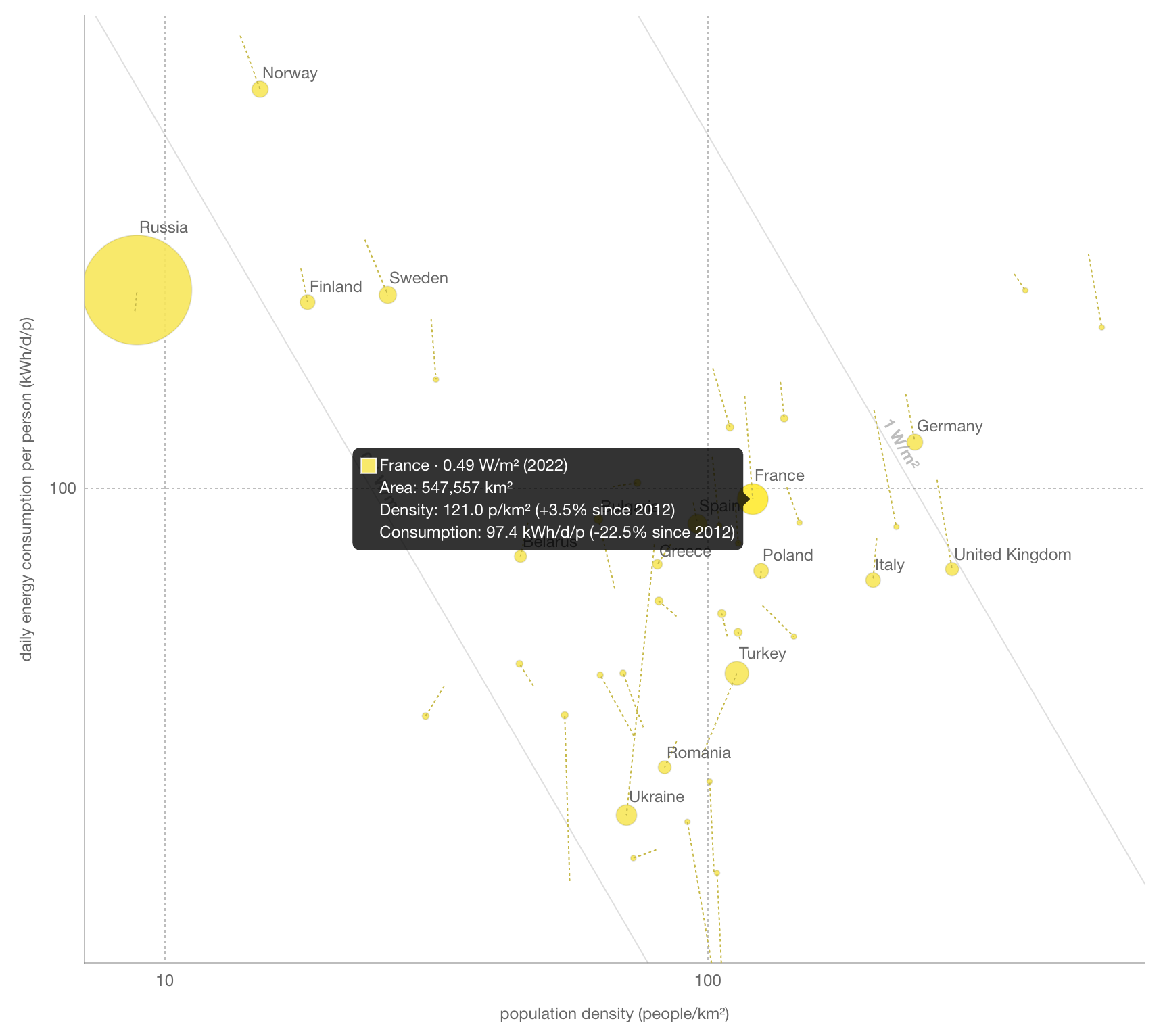
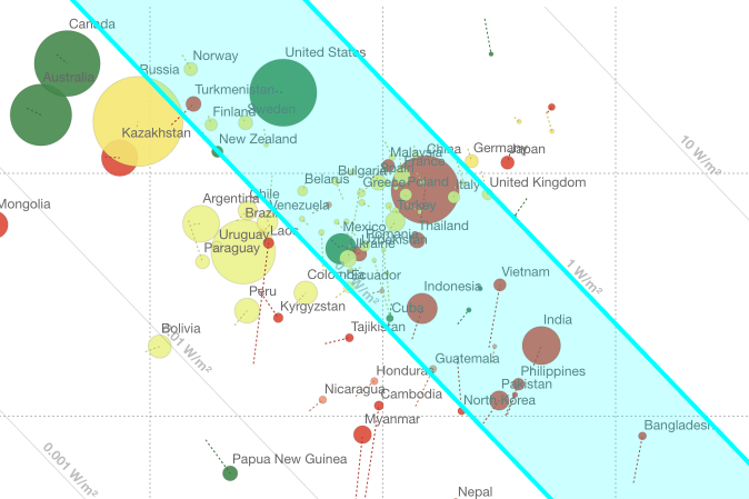
What does energy consumption vs. land area look like today? If you watch David’s TED talk, this is a highly interesting visualization, because it gives you a sense of how much primary energy the average citizen of a country consumes in relation to the population density of that country. As a bonus, David also added historic tails for each data point, so you can see how this has changed over the past 10 years.
What’s the surface power density of different energy types? We know that fossil fuels have much higher power density than renewables but what difference are we talking about? Technologies like solar have continously improved their efficiency in the last 20 years, so where are we at today?
What portion of primary energy consumption is covered by renewables for a given country? As we continue to electrify everything, how far along are we? What portion of primary energy is use is electrified?
Lastly, and this was the question I was most curious about: What percentage of land in each country would be needed to obtain all of its primary energy from renewables?
I had the questions and I had the data, so I set out to do what any software engineer turned climate enthusiast would do: I created a website. Behold sustainable-energy.info:
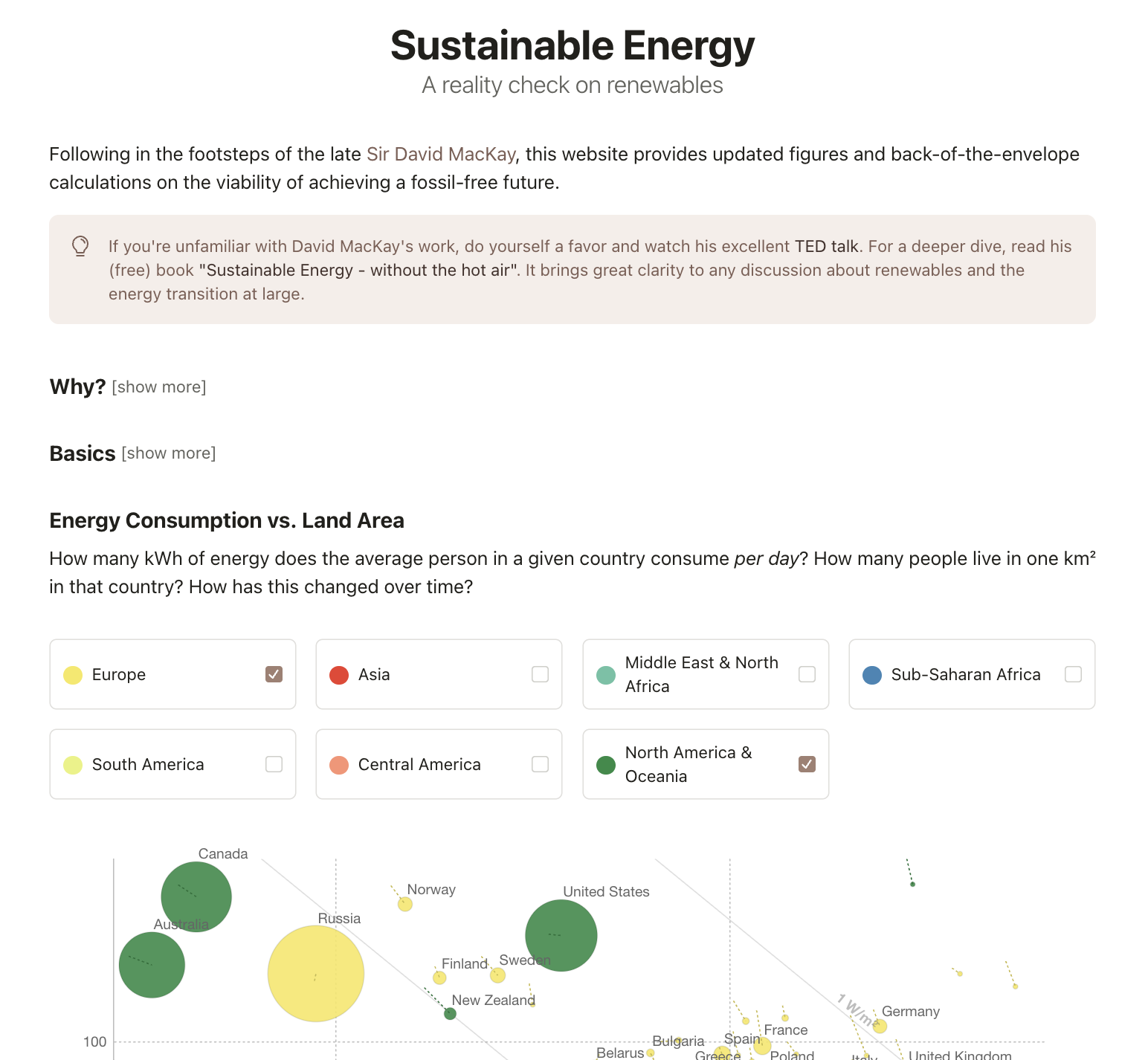
Feel free to browse the site and play with the interactive graphs. I will discuss some of noteworthy findings in the following.
01. Energy Consumption vs. Land Area
As pointed out in David’s TED talk, most developed countries have already reached or surpassed peak consumption. They are also attractive places to live in, so their population density has increased. That means the blobs of these countries (whose size is proportional to their land area, by the way) are moving “down and to the right”. This is visible in the tails of most European countries (with the notable exception of Ukraine, which has sadly seen a decline in population since Russia’s invasion of Crimea in 2014).
Asian countries have an impressive span of population density, all the way from Mongolia with 2.1 people per km² to Singapore with over 7,800 (!) people per km².
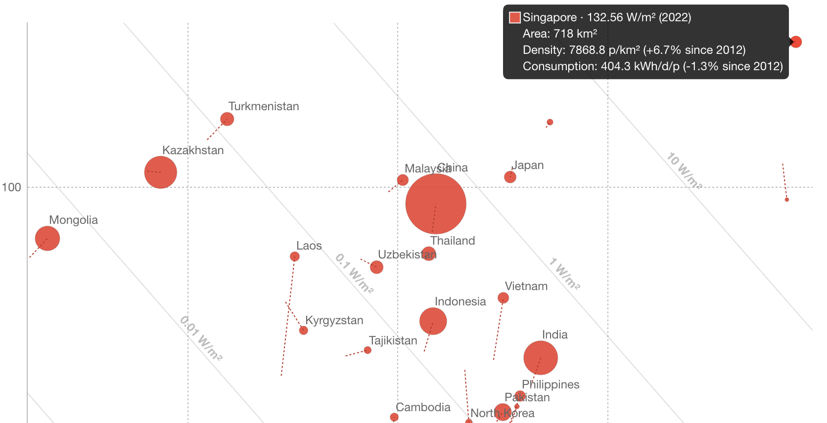
The diagonal lines in the graph show constant power consumption density, i.e. the power per unit land area required to provide the people’s energy consumption. A general takeaway seems to be that developed countries eventually settle in the 0.1 - 1.0 W/m² area, except for countries with disproportionately large amounts of land, like Canada, Australia and Brazil.
02. Surface Power Density
As expected, fossil fuels and nuclear have the highest power densities. Extracting natural gas from a (suitable) patch of land yields more than 200x as much power as you would gain from placing a solar farm on that land. Obviously, this comparison is lopsided, as natural gas is finite and extracting it has negative environmental externalities. Still, it explains why for many decades we have preferred getting energy from the earth’s crust instead of worrying about making our supply renewable. Looking into renewables, three things stood out to me:
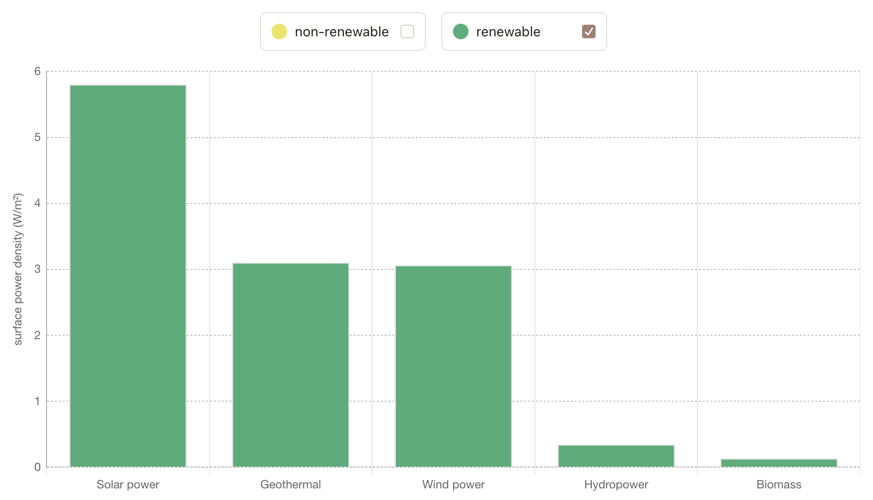
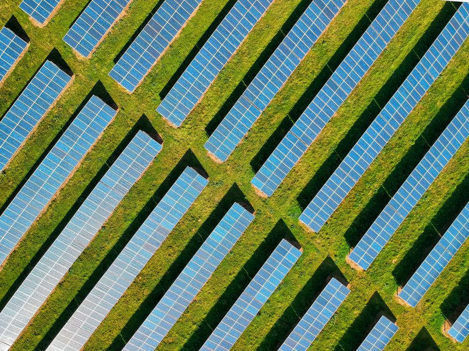
Not only is solar power the most area-efficient renewable technology but it is also the only one whose power density is still growing (by ~0.4 W/m² per year), mostly due to increases in panel efficiency. Note that we’re looking at utility-scale solar here, so even though your residential rooftop panels may have ~20 W/m², large-scale solar farms have lower density because of maintenance and compliance spacing requirements.
Wind power has not seen increases in surface power density. This may seem counterintuitive, as there has been lots of technological innovation leading to ever larger and higher wind turbines, off- and onshore. But, as pointed out by David in the book, this also means turbines have to be spaced further apart, so the power per unit land area does not change.
Using biomass for energy production is a really bad use of land area. Of course there are scenarios where, for lack of alternatives, this is still the most sensible option, e.g. when burning waste or wood for heating. But planting “energy crops” to produce biofuels is highly inefficent and should neither be encouraged nor subsidized. The land can be used more efficiently by harvesting solar power or growing crops for food consumption (or both).
03. Primary Energy Use vs. Renewables
Once I had built it, this section quickly became the most interesting to explore, as it shows each country’s energy mix side-by-side with its electricity demand and total primary energy use. The most striking revelation to me was how much we pat ourselves on the back (in news headlines, government reports etc.) for producing “clean electricity” and how little of our primary energy use we have actually shifted to renewables.
Go ahead and try it out for your country: Untick the “Primary energy consumption” checkbox and look at the development of renewables from 2013 to 2023 (or similar) in comparison to electricity demand. For most countries, this should evoke a reaction like “Wow, we’re not doing so bad!“. For instance, here is the notoriously fossil-fuel-loving USA:
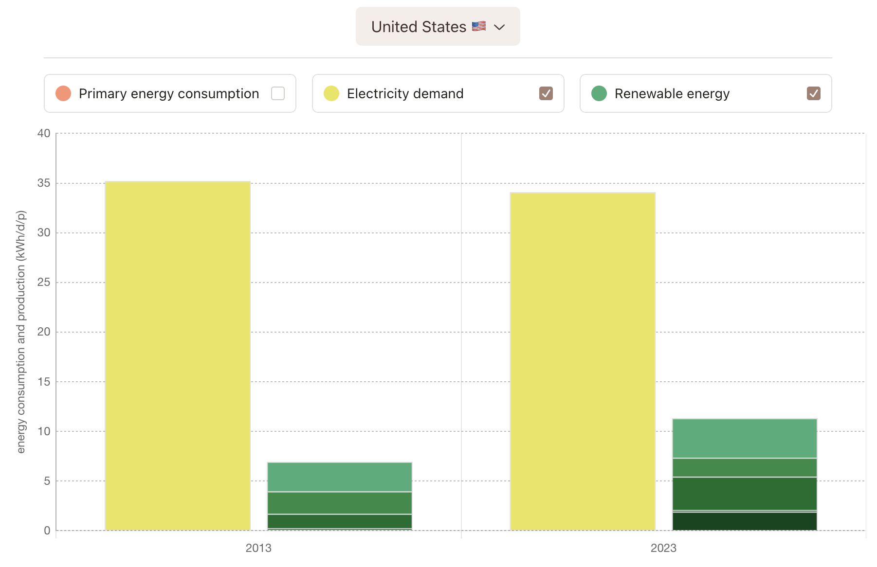
In 2023, a third of the entire US electricity demand was already provided by renewables. Pretty good! And the renewables buildout is accelerating, so surely we’re on a good path to fossil-free energy by 2050. Right? … Right? Well, now tick the “Primary energy consumption” checkbox and look again.
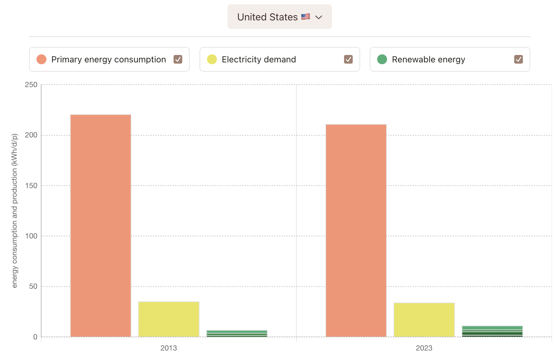
While solar, wind, hydro and friends did in fact provide 33.2% of electricity in 2023, that was a meager 5.4% of the total primary energy consumption in the US. The reason for this, of course, is that primary energy use also includes transport (cars, planes, trains, ships) and heating (hello oil and gas). It’s no different in other countries: In Germany, where I live, there are recurring announcements that we just had the cleanest day/week/month of electricity production ever. Which - don’t get me wrong - is good news that should be shared far and wide. Yet, in 2023, with over 50% of electricity coming from renewables, the 9 “lightbulbs per person per day” produced mostly by wind and solar did not even account for 10% of the 104 lightbulbs used by the average German, driving their state-subsidized combustion-engine car to work and heating their home with imported natural gas. Even model countries like Norway still have a long way to go:
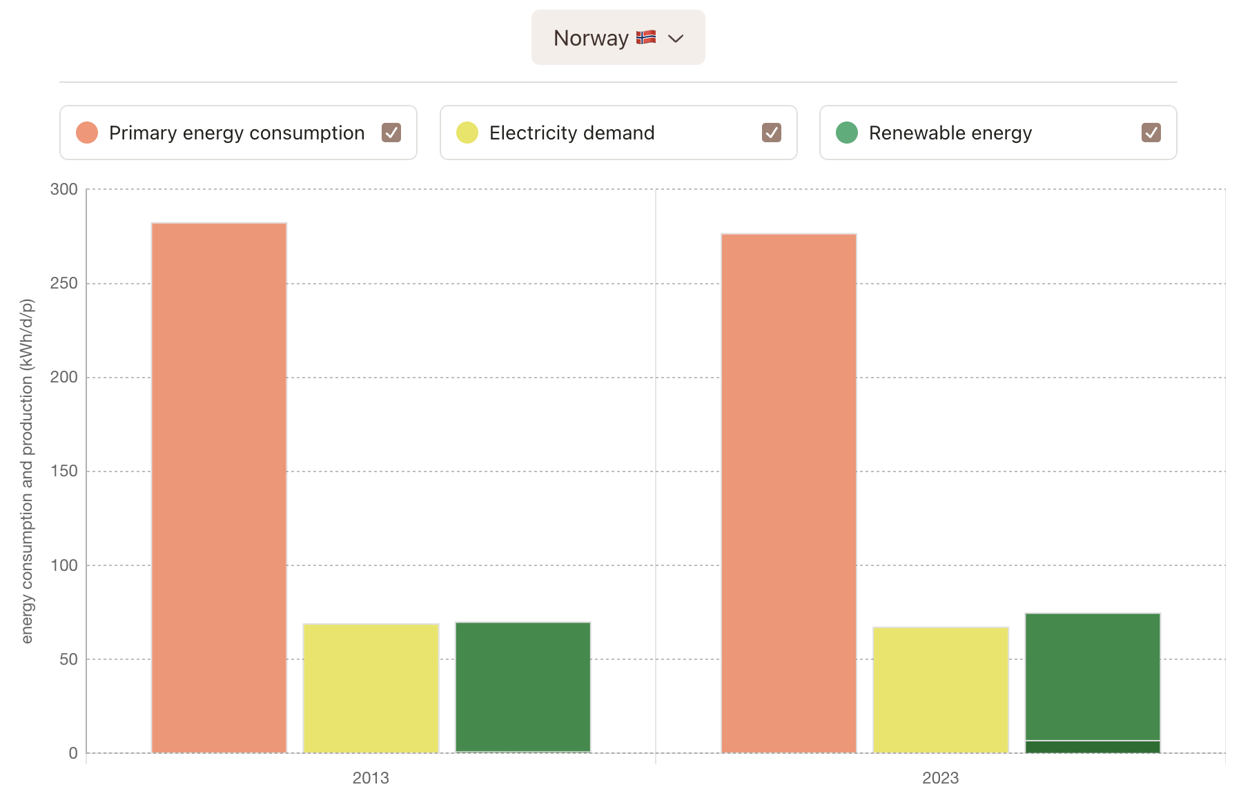
Notably, Norway has been producing more electricity than it consumes (mostly from hydropower) for more than a decade - it is an exporter of clean electricity. And yet, all this electricity does not even make up 30% of the primary energy used by its population.
These numbers are certainly not encouraging. You could be forgiven to think it’s pretty much impossible to rid humanity of its fossil addiction until 2050. Yet, three things lead me to believe that we have a fair chance of achieving this goal:
After two centuries of fossil-based growth and prosperity, we have only relatively recently begun to shift our attention and resources to electrifying everything. In the short space of time that we have done this, we’ve already come a long way (EVs, heat pumps, solar, batteries etc.) and are currently finding solutions to defossilize the remaining “hard-to-abate” sectors (aviation, shipping, cement, steel etc.).
As the energy transition gains momentum, we are crossing “points of no return”. Solar and wind are already the cheapest form of abundantly available energy, worldwide. Because of decades of battery R&D, in about two years time electric vehicles will have better range and cost less than combustion-engine cars, at which point driving an EV will become a no-brainer. Similar developments are happening for heating and cooling in both industrial and residential settings. As we reach these (positive) tipping points, the wind-down of fossil fuels will accelerate. It may have taken decades for coal, oil and gas to go from over 90% to 80% of primary energy, but the next reduction intervals will be larger and happen much, much faster.
Lastly, as we electrify everything, we reduce our overall primary energy consumption because electrified systems tend to be much more efficient. This is true for household appliances, for the famed “well to wheel” efficiency of ICE cars vs. EVs, it is true for heat pumps vs. combustion-based heating and most importantly it is true for producing energy itself. Obtaining energy from fossil fuels is highly inefficient as a whopping 67% ends up being wasted as “rejected energy”, mostly lost as heat to the environment.
So yeah, while 25 years is not a lof time, these factors make me optimistic we will see rapid inevitable progress in the coming decades.
04. Required Land Area
OK, on to the final question: If a country were to obtain all of its primary energy from renewables, how much of its land would need to be covered with wind, solar, hydro etc.?
Note: This is a hypothetical question, as it ignores a number of issues such as renewable intermittency, storage and distribution as well as the fact that some countries may simply not have enough available land area. Nonetheless, I think the back-of-the-envelope calculation is highly interesting, as it gives us a good sense of scale and a lower bound on land use for complete fossil independence.
Again, feel free to check the land use forecast for your country. Building the model required finding a projection of 2050 total energy consumption (I used the OPEC forecast - take that, oil barons!) as well as predicting the 2050 energy mix for each country (I came up with what I believe is a reasonable extrapolation based on surface power densities). Within the website section, you can click on ”[show more]” to see a detailed explanation of how I derived the 2050 projection:
Let’s look at a few countries.
India 🇮🇳
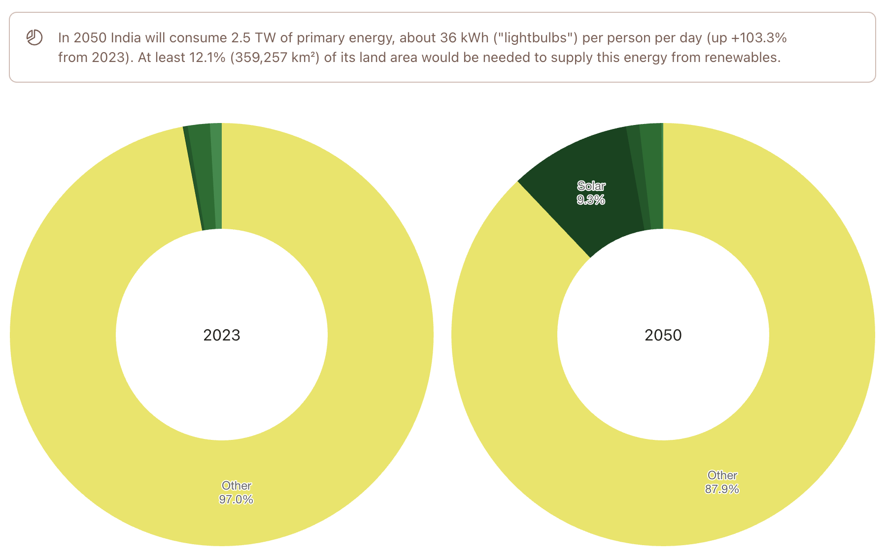
Investing 12.1% of land to supply 1.7 billion people with clean, renewable energy seems like a good deal.
China 🇨🇳
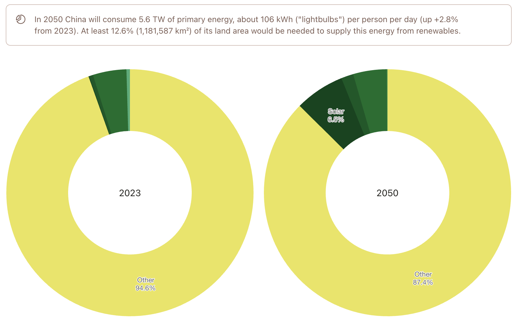
Interestingly, although China will have reached “western” levels of consumption at 106 “lightbulbs per person per day” by 2050 (3x the consumption of India), it would also only need 12.6% of its land area to provide 1.3 billion people with the required energy from renewable sources. That seems doable.
Let’s look a few smaller (and less hopeful) cases.
Qatar 🇶🇦
Qatar is the country with the highest per-capita consumption worldwide, an insane 622 kWh per person per day. It’s also a tiny country in terms of land area. Would they have a chance to supply 4.1 million Qataris with clean, renewable energy in 2050?
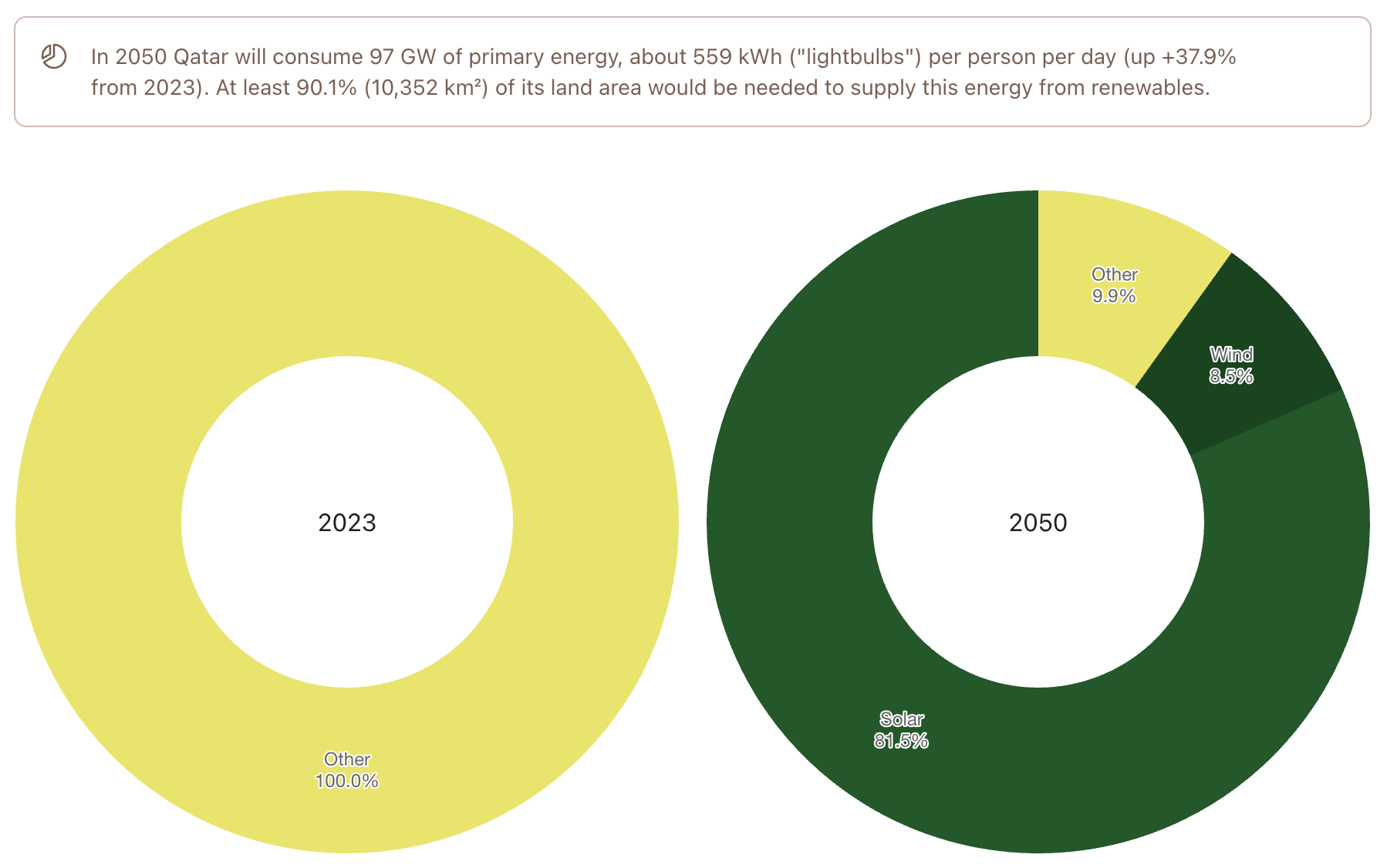
Covering 90% of land area doesn’t sound viable. Qatar will have to milk its oil and gas resources for as long as possible and - once they run out - buy their energy from elsewhere.
Singapore 🇸🇬
Again, a tiny country with high per-capita consumption.
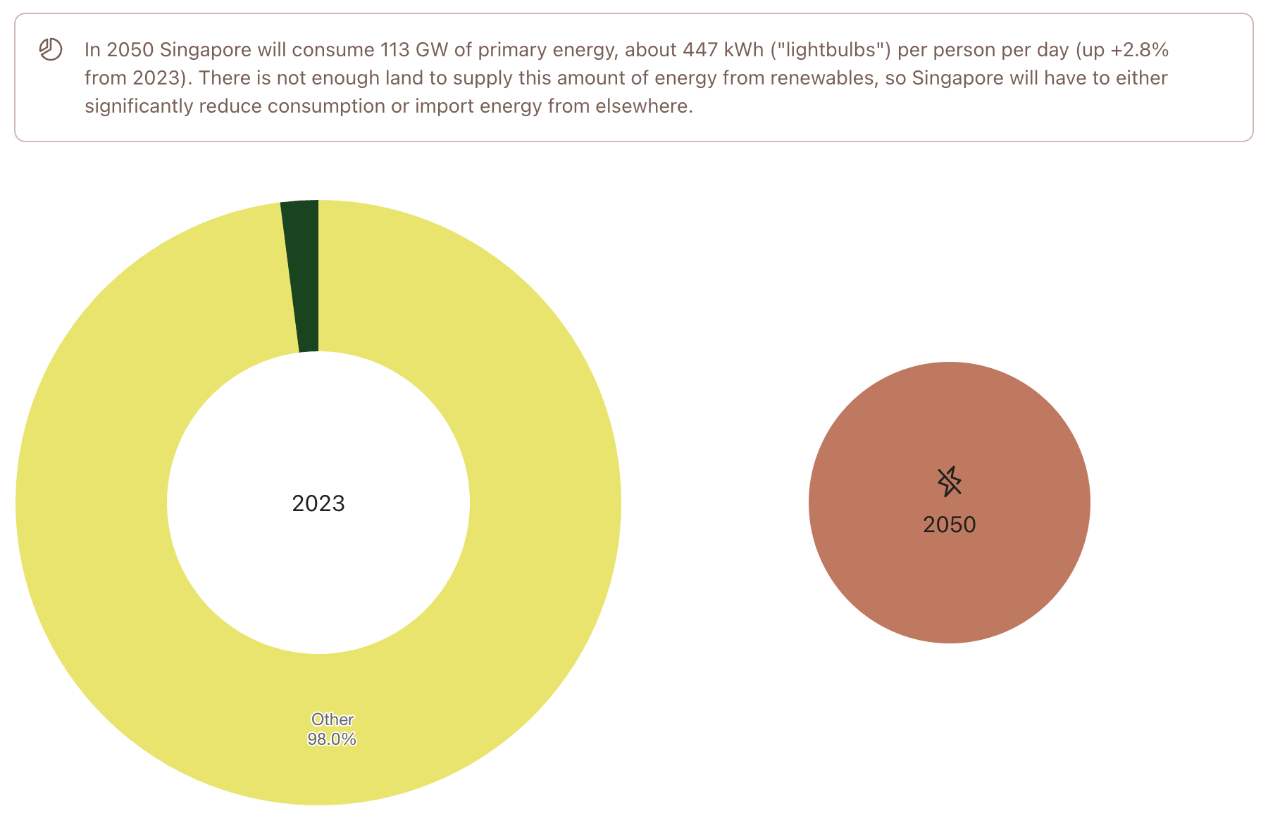
Oops. With its forecasted population (6.1 million) and consumption (447 kWh/p/d), Singapore has no way of achieving energy autonomy with renewables. It will need to reduce consumption and import energy.
Lastly, how about Northern Europe?
United Kingdom 🇬🇧
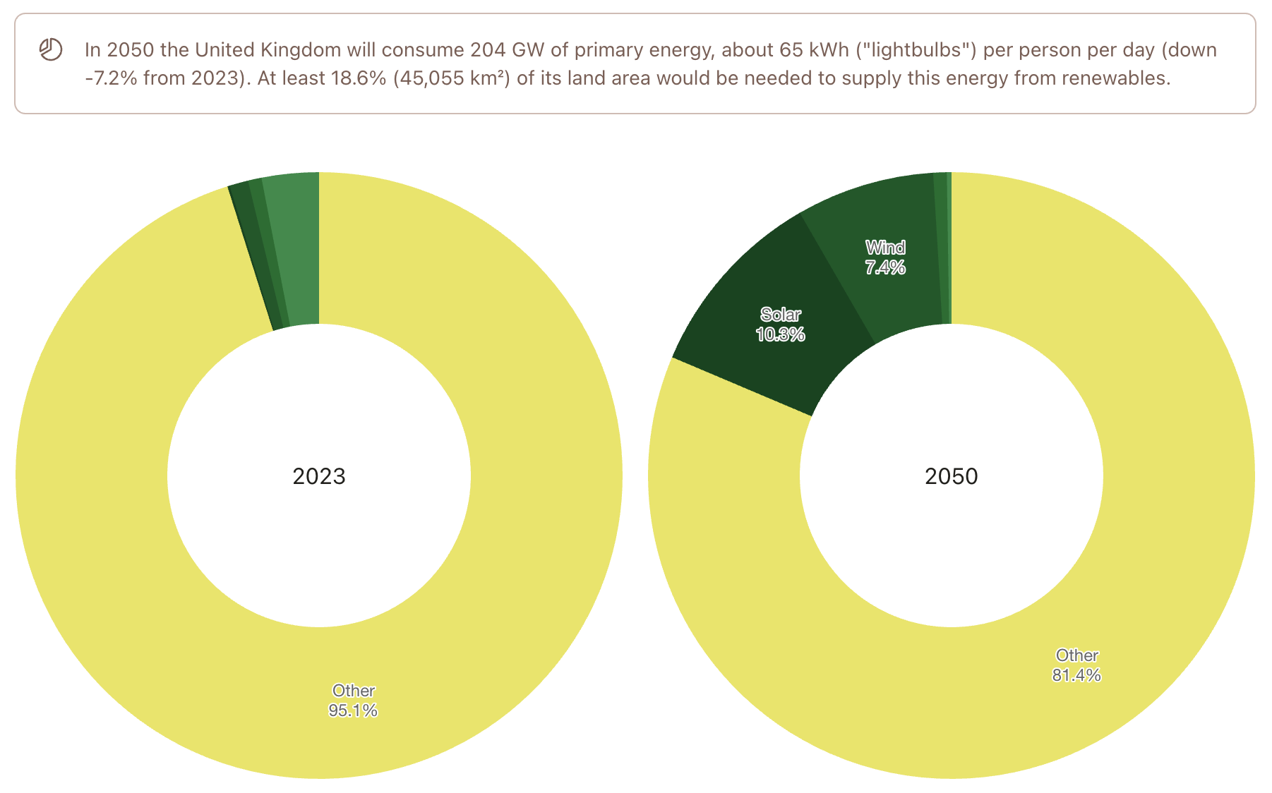
Covering 18.6% of land with renewables seems hefty, but not impossible. Given that the UK also harvests great amounts of offshore wind (not considered here) and has made significant progress in reducing their per-capita consumption, they should be able to find a renewable energy mix that “adds up” until 2050.
Germany 🇩🇪
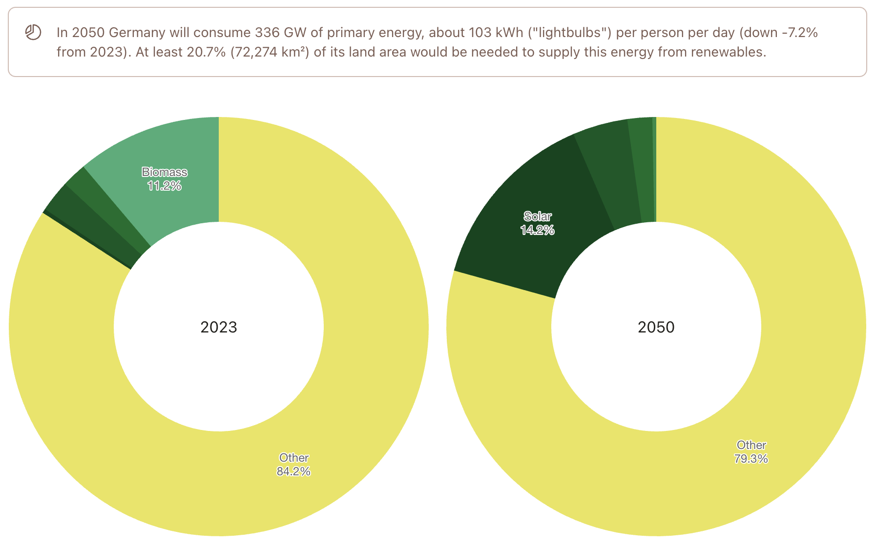
Covering 20% of land with renewables seems to be at the upper end of what a country with 80 million residents could feasibly do, but it’s not impossible. 50% of German land is used for agriculture today, some of it (pointlessly) for “energy crops”. A lot of these fields are currently converted to solar farms as part of an accelerating buildout. Wind farms are already well established. There is research and PoC projects on agrivoltaics, which would allow “dual use” of agricultural land - growing fruit and other plants in the pleasent shade of PV panels.
Others
There are plenty more interesting countries to look at - in the Americas, in Asia, in Africa etc. I encourage you to plunge in and explore for yourself.
Remarks
Let’s sum up what we learned from the data:
A healthy power density with which countries can sustain modern levels of consumption seems to be 0.1 - 1.0 W/m².
Utility-scale solar is the renewable energy source with the best surface power density and is still getting more efficient.
Many countries produce the majority of their electricity from renewables (which is great), but overall primary energy use is still heavily reliant on fossil fuels, mostly because of transport and heating. This will change rapidly in the next two decades as we continue to aggressively electrify everything.
Most countries with larger populations would need 10-25% of their land area to obtain all of their primary energy from renewables. This is doable, especially if we find good solutions for combining agriculture and solar PV.
Nice. In closing it seems like despite all the doomsday headlines on climate change, we have made a lot of progress since David MacKay first started to tackle these questions. His biggest wish was for people to have informed and “numerate” discussions about energy. Looking at the updated figures, my impression is that - although some puzzle pieces are still missing and although we still have a long way to go in this massive transition - most countries will be able to find a “plan that adds up”.
Questions
Aren’t some of these numbers nonsense?
Maybe. A lot of the calculations are based on assumptions. You might argue that the OPEC is wrong about future consumption or the UN is wrong about population growth. You might disagree with the way I chose to model the renewable mix for 2050. None of this changes the big picture, though - humanity will continue to consume growing amounts of primary energy and we will need to transition away from fossil fuels asap. The back-of-the-envelope numbers give you a lower bound on required land area. If you’d like to build more wind or hydro instead of solar, fine - but you’ll need more land. If your population forecast includes less people living on earth, the numbers go down slightly, but most countries will still need double digit percentages of land to supply their populace with the required renewable energy.
What about nuclear?
I have included a more detailed FAQ item about this on the website. In short, nuclear fission won’t save the day - it is not as “clean and firm” as one would hope and it’s too slow (in terms of buildout) and too expensive to compete with renewables going forward.
What about fusion?
It sure would be nice to have a limitless supply of clean energy with high surface power density and no negative externalities. But commercially scalable fusion reactors don’t exist and won’t arrive in time to save us from climate disaster. If they become viable later this century (and that’s a big if) we can happily start deploying them and gradually rewild the land that’s covered with solar panels. Until then, we’ll have to the use the fusion reactor that sits right there in the sky and harvest its virtually limitless supply of clean energy, albeit with slightly lower surface power density.
How did you build the website? How often will the numbers be updated?
I am glad you asked. The site is a self-contained static NextJS web app with a few pre-build scripts that fetch the data and crunch the numbers. Its hosted on GitLab pages and is automatically built when I push something to the repository. I plan to update and check the numbers twice a year. If you notice discrepancies or have suggestions or ideas for enhancements, please don’t hesitate to get in touch.
Well - that’s it. As always, thanks for tuning in and if you have questions, leave a comment below. To receive updates about future posts like this, you can subscribe via the RSS feed.